Breaking the Mold.
Bearing the name of the infamous blood-sucking cryptid of Central American lore, El Chupacabra is a Seattle-based restaurant that describes itself as a punk rock cantina and is known for it’s happy hours (twice daily), margaritas, and mission style Mexican food. While it’d be a stretch to describe their food as anything approaching authentic, they have two locations offering a neighborhood hangout that is authentically unique.
Room for Improvement.
Thing 1
Not only are there currently two separate websites for each of their locations, but both lack meaningful hierarchy, overlay text on busy images, and create unnecessary effort for the user.
Thing 2
While there is a general theme that carries throughout their brand, there is no consistency in execution or visual language.
Goal.
Create a new website for El Chupacabra that provides a better user experience, communicates a more thoughtful brand identity, and takes into account multiple viewports.
Mapping it Out.
In an effort to simplify the user experience, I organized the content into a simple sitemap.
A New Direction.
Since this was essentially a self-directed project (i.e. no client involvement), I decided a rebrand was in order. I began reflecting on the stories of Chupacabras I heard growing up in South Texas, as well as the vast deserts of the American Southwest that seemed to be particularly hospitable to the mythic beast. I created a moodboard based on these associations.
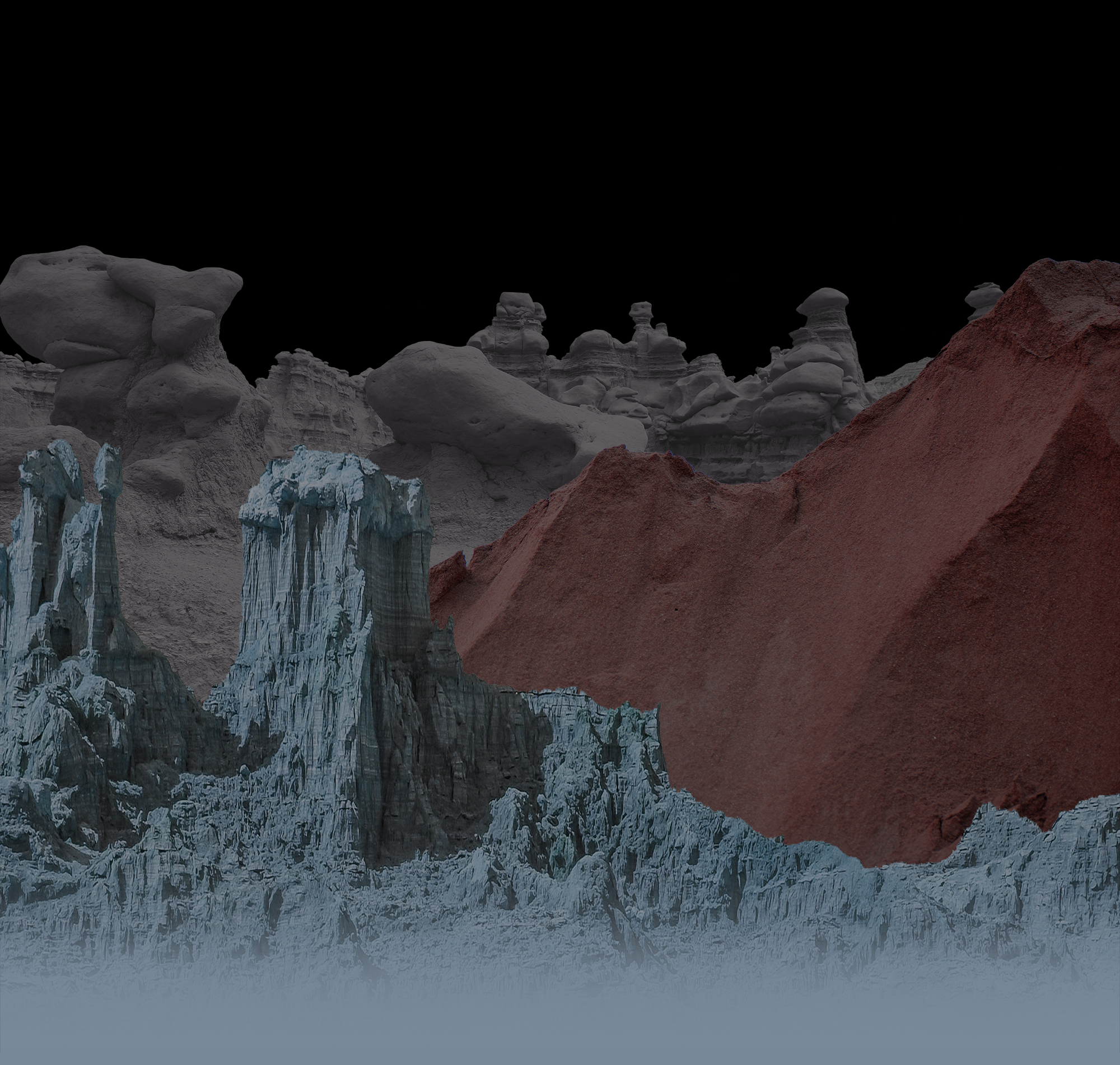
Since El Chupacabra offers a late night Happy Hour and Chupacabras are reportedly nocturnal, I wanted to capture the mood of dusk settling over the desert after a storm and the irrational — yet exhilarating — feeling that something otherworldly could be lurking in the shadows. As every horror aficionado knows, the unknown is often best hinted at.
Building it Better.
Next, I began wireframing and quickly worked up this grayscale design.
Final Design.
I decided the aesthetic of the website should be moodier and more mysterious. I continued to explore themes of the unknown, channeling the feeling of being engulfed in expansive darkness, as well as reflecting on time I had spent in Roswell, New Mexico and the anxious anticipation of attempting to see the Marfa Lights in West Texas.
The end result was a design that felt modern, but slightly otherworldly. The typeface Klaxons alludes to the electric charge of neon lights, but paired with storm clouds and in stark black and white comes across as cold and sinister, much like a reptilian desert creature.
The desktop version features navigation buttons that limit the choices to only essential user flows.
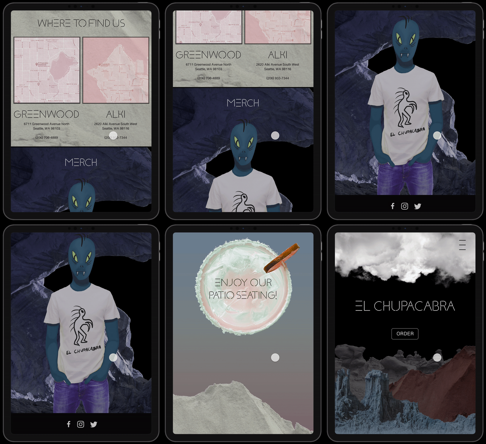
Mobile versions opt for a single call to action (“Order”), while other navigation options are accessible through a hamburger menu that mimics the “E” in the restaurant’s name.
Let’s Go for a Scroll.
Simple.
The homepage contains information about Happy Hours, Locations, and Merchandise.
Navigation.
Mobile
Users can choose to Order through a 3rd party delivery service, view the restaurant Menu, or explore the FAQ for more information on El Chupacabra.
Desktop
The desktop user is immediately presented with navigation buttons that limit the choices to only essential user flows.
Note: This is a student project completed as part of SVC’s UI Certificate program.


